
Match the booking widget to your brand
Change the calendar colors and store logo, then check the storefront master switch.
Use Settings → Theme to give the booking widget your store's colors. This page also contains the switch that allows the storefront widget to run.
Set the calendar colors
- Open Settings → Theme.
- Under Calendar Styling, choose Available Date Color and Selected Date Color.
- Click Save, then open a live booking-enabled product page to check contrast against your theme.
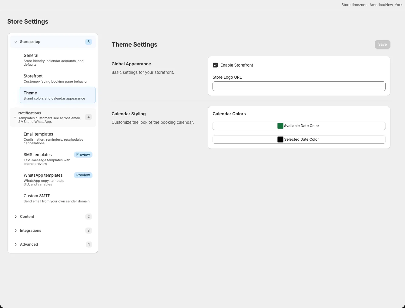
The selected color should remain visible when a date is chosen. Preview the customer page on both desktop and mobile after changing colors; the admin preview does not include every theme or checkout detail.
Set the store logo
Enter a publicly accessible image URL in Store Logo URL under Global Appearance, then click Save. The same store logo setting also appears under Settings → General. It is used on customer-facing pages and in email contexts, so use an image that remains clear at small sizes.
If the image does not show, open the URL in a private browser window to check that customers can access it without signing in. Avoid URLs to files that require your admin session.
Check the storefront switch
Under Global Appearance, turn on Enable Storefront and save. The theme's app embed is another required switch for automatic placement on product pages. See Place the widget in your theme for the theme editor steps.
Open a product connected to an active event to inspect the result. A product without an active event will not demonstrate the booking widget, even when the colors and storefront switch are configured.